Announcing the new MyGeotab user interface
We're rolling out a fresh look and optimised experience for users.
By Geotab Team
May 30, 2022
.jpg)
Geotab is committed to ensuring that every user has a great experience using MyGeotab. That's why we had a dedicated team consisting of individuals from product management, product design, UX research and development for the past year, to speak to our end users and find ways to improve their experience. We're excited to announce our rolling launch of our new user MyGeotab interface (UI).
New changes in MyGeotab:
- Clean look and clear hierarchy to find what you need faster
- Increased white space and consistent typography to make items easier to read
- Consistent actions and interactions so that you can learn how to use the software faster and get your tasks done
- Customisable table structure for more control
- Optimised mobile experience
Design principles behind the new MyGeotab user interface
Here are the main design principles we followed when creating the new UI refresh of MyGeotab's interface.
Clear visual hierarchy
.png)
Visual hierarchy was important to establish for our design system as users instinctively pay attention to the order and priority of the elements they interact with. Primary functions should be noticed faster than others, but secondary and tertiary functions should also be presented with the appropriate amount of attention.
Colour is key to the visual hierarchy of a page, as well as size, placement and order. Some examples of how colour was used in the new UI refresh to establish a clear hierarchy:
- We removed colour from the side navigation menu icons to reduce the amount of attention given to the menu, while also giving the user an indication of where they are in the system by highlighting the navigation item in a brighter colour.
- Primary action buttons are coloured differently than secondary buttons, giving the user a clear understanding of the main action of a page or pop-up.
- Red is used consistently to indicate that something needs attention, such as an error message, alert, device disconnection, or for system notifications that need attention.
- Only interactive (linked) text in the page content is shown in blue.
- Drop shadows were used on drop-down menus, pop-ups and panels that overlay the content below them, thus adding a visual hierarchy to sections of a page.
Consistent actions and interactions
We've designed a library of components and UI patterns that are consistent across the MyGeotab design system. This library includes input controls, navigational components, informational components and containers.
Consistent actions remove the need for user discovery and therefore make their task flow run more smoothly. If a user knows how to use the functionality in one section, they know how to use it in all sections if it's consistent.
White space and content legibility
The small space between design elements is something we call micro white space; it can be found between lines and paragraphs or the space used to separate menu items. We've increased the amount of white space overall to allow for easier legibility of content inside tables and to help clarify separation of elements on a page. Micro white spaces are being used instead of horizontal lines which can clutter a screen.
Typography
Consistent typography was key to help increase scannability, legibility and readability. Different sizes, fonts and arrangement of the text establish a hierarchy on the page. The font we are using is Roboto, which is a modern, accessible and versatile font.
A responsive type scale was implemented to preserve visual hierarchy across the various screen widths of devices, so a title on a desktop screen will be scaled down on a mobile device, but still have a title size appropriate for a mobile screen size.
Important considerations
Mobile experience
We set out to improve the mobile experience of MyGeotab in the process of this project. We wanted to ensure that screens were optimised for mobile devices. You will see below some notable changes:
Here is the new design on the left versus the old design:
.gif)
.gif)
New table structure
This is a new design that we are introducing throughout MyGeotab. This tabular structure can be customised to your liking. You can see various data points associated with the page you are on and you can easily customise the columns you'd like visible, as well as the order in which the columns are laid out.
.gif)
Accessibility
MyGeotab conforms with WCAG 2.0 AA Guidelines. We have updated all colours used within MyGeotab, including even the logo and favicon to ensure that everything is accessible.
Timeline and how can you get your hands on the new interface
The new user interface will be going out in the 2102 release of MyGeotab. Users can expect to start seeing the new changes effective towards the end of June 2021 in their MyGeotab database.
To verify your version: go to MyGeotab > Administration > About and check the build number, (e.g. 5.7.2102.xxx release).
Did you know you can actually see the new user interface in action today? It is available in Feature Preview to all users running the 2004 release of MyGeotab or later. To use items in Feature Preview, you must toggle Feature Preview to ON under your user options or by navigating to Administration > Users and selecting the user you'd like to enable it for from the main menu.
Frequently asked questions:
Why did you take colour away from the menu icons? It helped me remember what each menu item was.
Great question! This is the most common piece of feedback we have received to date. It wasn't an easy decision, and there was a lot of thought put into it. It all comes back to visual hierarchy.
.png)
When you look at the current user interface and the various colours being used in its icons, you'll notice that there isn't much of a hierarchy here. All of the icons look equally as important, and when looking at the screen, users' eyes are automatically drawn to these icons.
For example, the red icon for "Rules" is something that your eyes will naturally be drawn to instinctively. Having the menu designed with these colours doesn't allow us to use colour to draw our end users' attention to something critical. There may be more important information being presented where we want users to focus their attention, such as a report explaining important safety events that the fleet manager must take note of. Overall, we wanted to ensure that users get the most of the time they spend in their database each day and can easily focus on the tasks that they are performing.
Looking through some of the other applications you may be using in your everyday life, you'll quickly notice this design principle of visual hierarchy is not uncommon.
Gmail: You will notice that all of the icons in its vertical menu are greyscale with colour being used to highlight something important — in this case the fact that you are in your inbox.
.png)
LinkedIn: The horizontal navigation menu icons in LinkedIn are greyscale, with colour being used to highlight something important, like new messages and notifications.
.png)
Twitter: All of the icons are greyscale in its vertical navigation menu, with colour being used to highlight something important — in this case new notifications.
.png)
Facebook: Facebook also uses greyscale icons in its horizontal navigation menu, with colours being used to highlight something important, such as the fact that you are on the home page, as well as notifications on different menu items.
.png)
The new user interface looks very white. Why is there so much whitespace?
Mozart famously said: "The music is not in the notes, but in the silence between."
We wanted to ensure readability of the content laid out on pages as users visited the different parts of the system. To help prevent overload, we made a conscious effort to introduce white space wherever it made sense to ensure that content was legible and to separate elements from each other.
On the Visual Hierarchy Blog they explain: "White space can be compared to the mortar used between bricks in construction, or the adhesive used in a stained glass mosaic. Although we may admire the pattern of the bricks and the stained glass, it is what is in between and holding everything together that is lately responsible for the flow and overall appearance of the design."
To learn about the latest features in MyGeotab, see our Updates section on the Blog.
See also: What’s new in MyGeotab — Version 7.0
Subscribe to the Geotab Blog
The Geotab Team write about company news.
Table of contents
Subscribe to the Geotab Blog
Related posts
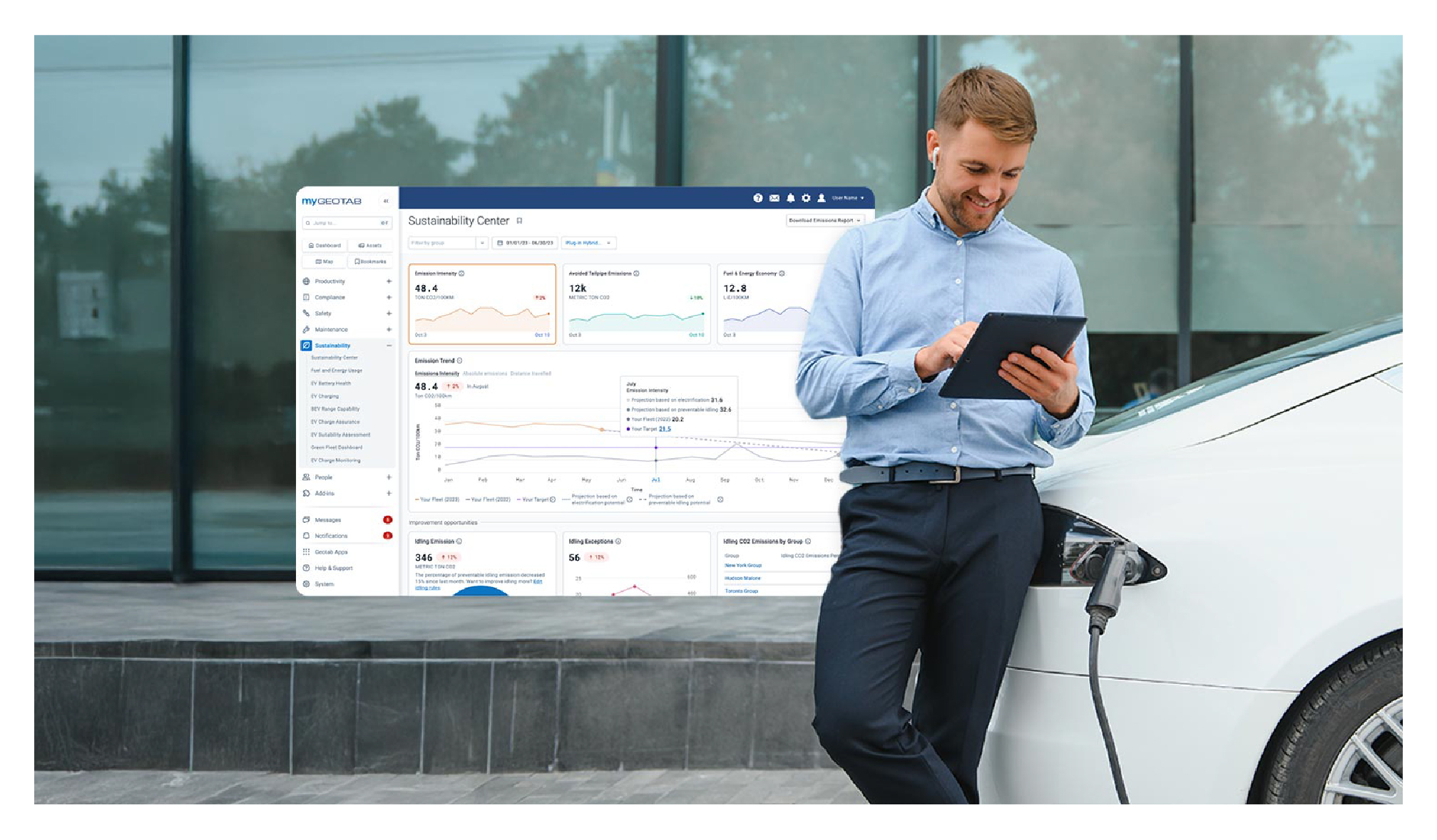
Geotab’s new fleet Sustainability Center simplifies fuel and emissions reduction
June 13, 2025
3 minute read
Data-Driven Innovations in Fleet Management: highlights from Geotab Mobility Connect 2024
November 28, 2024
3 minute read


Introducing Active Insights: Push-Based telematics intelligence
February 7, 2023
2 minute read