Trips summary reporting
A review of the trips summary reporting feature in MyGeotab and how to compare the performance of vehicles, drivers, or groups.
By Geotab
Dec 28, 2023

The trips summary reporting feature within the MyGeotab fleet management software system gives users a summarized view of all historic trip information, including fleet performance. Visualizing data in a meaningful context allows users to quickly compare how well (or poorly) vehicles, drivers or groups are performing as a whole and in relation to each other. In this post, we will explore the usage of trips summary reporting and the powerful tools it provides to organize and analyse fleet trip data.
See Also: What's new in Geotab Drive - Version 6.0
Getting Started
Note: If you have a very large fleet of vehicles you may want to use the organization filter in the top left hand corner to select a subset of vehicles by selecting a sub group.
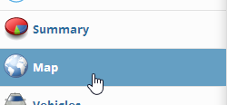
Navigate to the Trips History page by clicking:
- Maps from the main menu
- Trips History from the Maps toolbar
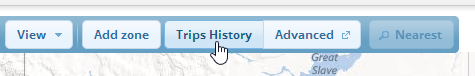
- Summary from the Trips History toolbar

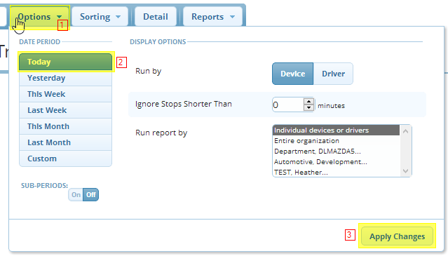
- Start by clicking the Options button.The options menu as a few tools for filtering your fleet data, for now we will start with a simple example.
- Select Today under the “Date Period” heading
- Click Apply.
Visualizing the Data
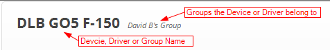
A list of data rows will be generated. Each data row contains the:
- Vehicle name, or group name when run by group
- List of groups the vehicle belongs to
- Three charts:
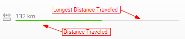
Distance Line – a line representing the Distance Traveled (Green) in relation to the Longest Distance Traveled (Grey). Hovering the mouse pointer over the line will show it in more detail and reveal a tool tip.
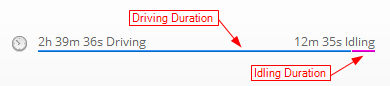
- Duration Line – a line representing the data row Total Driving Time (Blue) compared to the Idling Time (Purple). Hovering the mouse pointer over the line will show it in more detail.
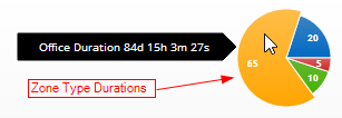
- Zone Duration – listing of the duration spent in each of four Zone types: Office (Orange), Home (Green), Customer (Red) and Non-Customer (Blue). The zone duration will be displayed as a pie chart when the vehicle has durations in more than one zone type so you can easily see how the durations relate to each other. Hovering the mouse pointer over a pie slice will show a tooltip with the zone type name and duration.
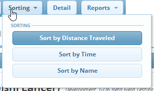
The results are sorted by distance by default, starting with the vehicle that has traveled the longest distance. Multiple sorting options are available by clicking the Sorting button and selecting a sort method from the list.
Filtering The Data (Options Panel In Detail)
The options panel contains some tools that can be used to broaden or narrow the focus of the results.
Under the Date Period heading there is the standard Checkmate date selection control. Below that is the Sub-Period toggle button. Turning the Sub-Period toggle button on will give three options Daily, Weekly and Monthly. When selected, this will break the results down into smaller sub sections for easy comparison of results by Sub Period. Note: this will also add 2 more selection to the Sorting menu.
Under the Display Options heading are three options.
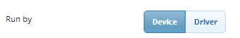
- This first is fairly self explanatory, here you can set whether to run the report by Device (Vehicle) or Driver.
- Second is the “Ignore Stops Shorter Than” filter. This will not use stops shorter than the entered value when retrieving the results.

- Third is the “Run Reports By” filter. This can be used to run the report by Individual Devices/Drivers or a Group (Ex. Entire Organization) or a sub set of groups. The group sub sets are pre-generated and are sets of groups that have the same parent group. For example; if we have two child groups under Entire Organization for Ontario and Florida we can more easily compare idling statistics for all the Devices or Divers in these groups (and their children) for a given period of time.
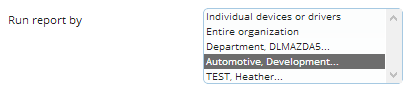
(Example run by groups)
The Trips Summary report is a powerful tool to visualize trip statistics in a simple and meaningful way. Hopefully this quick introduction will help you get started with the simple yet powerful tools available to you in the Trips Summary report.
Subscribe to get industry tips and insights
Geotab team
Subscribe to get industry tips and insights
Related posts

From video archives to active prevention: The case for AI dash cams
July 22, 2026
4 minute read

Closing blind spots in cargo security with a 360 fleet camera system
July 22, 2026
3 minute read
The safest mile in field service is the one nobody drives
July 22, 2026
2 minute read

Best small fleet management software providers and how to choose one for your business
July 16, 2026
8 minute read


Why field service routing decisions are costing you more than fuel (and how to fix it)
May 14, 2026
4 minute read