The new essential skill for managers: information graphics
Translating data into imagery can help communicate the value and lessons in the data to others. Read about the benefits of infographics for managers.

By Bernie Cheng
Dec 8, 2023

When you’re trying to share information, data alone isn’t enough. Charts, maps, dashboards, and information graphics help communicate the value or lessons in the data to others. Translating data into imagery — this is known as data visualization.
In addition to traditional management skills like communication and negotiation, data visualization is now an essential tool for managers. Harvard Business Review calls visual communication a “must-have skill for all managers.” As well, the Project Management Institute reports that data visualization is a required skill for analysts and project managers. Why? As the pace of work in business accelerates, the need to get the point across quickly becomes more urgent.
Visuals help convey the message clearly so that reviewers can make decisions — and make the right ones.
In a previous post, we introduced: What Is Data Visualization? In this article, we’ll take a look at why you should visualize your data, and how you can start visualizing that data to gain more actionable insights.
What Are Information Graphics (Infographics)?
An information graphic, often shortened to infographic, is simply information translated into an image or visual display. There are a number of ways to represent data, including bar, line and pie charts, maps, scatter plots, venn diagrams, timelines, hierarchies, flowcharts, word clouds, and many more options.
Benefits of Data Visualization
It’s easier to recognize patterns, trends and correlations between large data sets in a visual format than a text-based format, like a spreadsheet.
Dashboards and infographics really help us find the relationships between different variables. As an example, see the Geneology of Pop/Rock Music infographic which shows how popular music evolved from 1955 to the present. One of my favourite infographics, The Compendious Coffee Chart, has minimal numeric data and no pictographs, but is effective because its lines direct the reader’s attention.
Top 5 Benefits of Infographics:
- Makes data easier to understand.
- Uncovers the relationship between different variables.
- Conveys a sense of scale and gives context.
- Captures the attention of readers.
- Helps us learn and recall information better.
What Is the Use of Infographics? Learning by Seeing
Humans rely on visuals to learn. Research by 3M reveals that humans “process visuals 60,000 times faster than text” and that visuals dramatically improve learning, up to 400%. Since the time of cave paintings, humans have been using art and visuals to convey information.
We have millions and millions of neurons that are dedicated to processing visuals. The sensory cortex in the brain is more geared toward visual input (30%) over touch (8%) and hearing (3%). We have a higher ability to learn, recall, and understand information that is presented through images rather than words.
Imagine you’re trying to teach a child subtraction without any visual aids. If you tell the child or write out “ten minus four equals six” that could be difficult to understand or cause confusion. However, putting out 10 pieces of candy in front of the child then taking away four pieces would be much easier to understand.
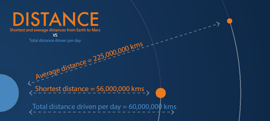
Another reason to visualize data is to convey a sense of scale and give context. For example, it’s estimated that the cumulative distance driven by every device in Geotab’s fleet of GO devices is approximately 60,000,000 kms per day. That’s an incredible number. However, the scale of that number is lost because no one can really comprehend that distance.
To give it a sense of scale, let’s look at the one way trip to Mars, as shown in the image below (not to scale).

Total distance driven per day by Geotab GO devices compared to the one way trip to Mars.
The closest distance between Earth and Mars is 56 million km. The cumulative distance driven by all vehicles equipped with a Geotab GO device could make that trip in less than a day. The average distance of 225 million kms between the two planets would be covered in less than 4 days!
If the infographic were drawn to scale, the line depicting the average distance would be more than twice as long, thus further enhancing the sense of how large the number is.
Quick Insights
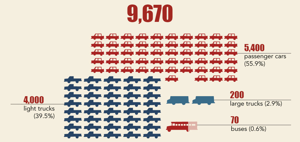
A common and effective method of displaying quantities is with pictographs, as we might remember from elementary school. For example, let’s say you need to present some information on the composition of a fleet.
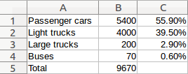
Now, consider the table and pictograph below.
Here is a vehicular breakdown of a mock fleet in a spreadsheet format:

Versus…
A pictograph of the same vehicular breakdown:

Both display the same data, but the pictograph conveys some additional information.
From a high level look at the pictograph, you can make these three simple observations:
- The fleet is comprised of cars, trucks, large trucks and buses.
- You can immediately see that there are significantly more cars and trucks than large trucks and buses.
- The fleet has slightly more cars than trucks.
These observations were made without even looking at the numbers. Once you add the raw data into the mix, you now have the inklings of an infographic.
Some other popular styles of information graphics include:
- Bar: Data across categories like miles driven by different units, safety reports of different drivers, or spending volume by department.
- Line Charts: You want to display trends over time like how a driver’s safety score has changed over the last year, fuel mileage saved on a monthly basis, the history of idling time for your vehicles.
- Pie Chart: Showing related percentages and proportions like percentage of drivers who hard brake (1, 2-5, or 5+ times), the percentage of drivers who speed, or overall percentage of fuel consumption (idling, driving, etc.).
- Scatter Plot: Find trends, concentrations, or outliers between different variables, e.g. safety scores compared to amount of time in driver training.
- Gantt Chart: Showing objects in use over time. For example, the duration and how a vehicle was used. If the vehicle was used for 5 hours, how much of that time was spent idling, stopped, or driving?
- Histogram: Showing data distributed across groups like driver safety on a given day or number of hard brakes by mileage driven.
Helpful Tips on Infographics
- Tell a Story — An infographic should be a visual story of your data; it should have some semblance of a beginning that introduces the theme or statement of the infographic, a middle that is backed with relevant facts and figures, and an end that offers some insight into the matter at hand. In essence, it should be like an graphic novel.
- Prepare Your Data First — Collect and verify your data before you start planning the information graphics. Having all the data will also help inform what type of chart or graphic you will use.
- Less is More — Keep it simple. Pick several key messages from the data and illustrate that so you don’t overwhelm your audience.
- Summarize — Once you have the data in a visual format, write short explanatory captions to further reinforce the message.
Final Thoughts
The value of an infographic lies not only in its ability to convey massive amounts of data in a visually appealing manner, but also to captivate the attention of its reader so that they may better understand the information.
Geotab collects billions points of data everyday, and without the help of data visualizations and infographics, those billions of points of data would be lost in an infinite sea of rows and columns in a spreadsheet.
To see how you can enhance your fleet data with visuals, take a look at our Driver Scorecard, which can be used to show driver performance in safety, productivity, fleet optimization or compliance.

Related:
Are You Getting the Most out of Your Telematics Data?
Subscribe to get industry tips and insights

Bernie Cheng is a Senior Software Developer and the Team Lead for the Data and Analytics' Data Visualization team. Bernie worked as a full-stack developer for the majority of his career, but recently has shifted his focus on client-side development using JavaScript and other Web technologies.
Table of Contents
Subscribe to get industry tips and insights
Related posts

How fleet telematics helps protect police officers and build community trust
May 11, 2026
4 minute read

Why maintenance scheduling for fleet assets requires more than a calendar
May 7, 2026
5 minute read

The plug-and-play rental fleet: Upgrade your technology without missing a single booking
April 27, 2026
5 minute read

What is remote fleet management? Benefits, features and top platforms
April 24, 2026
7 minute read

The asset black hole: Why your equipment disappears the moment it leaves your facility
April 23, 2026
4 minute read

The tech gap: Why fleets are falling behind on cargo security
April 22, 2026
4 minute read