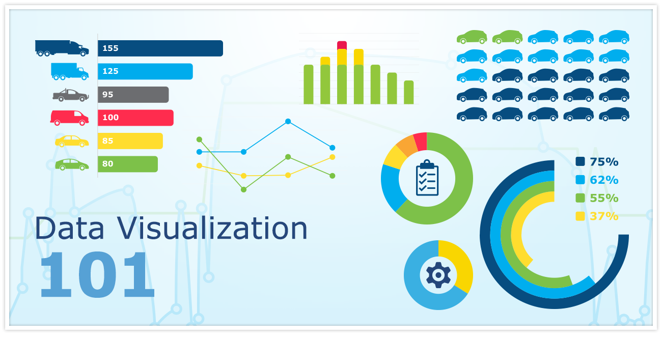
What is data visualization?
Learn about data visualization - an increasingly important tool to help fleets identify and understand trends in their telematics data.

By Mike Branch
Vice President, Data and Analytics at Geotab
Dec 28, 2023

Data visualization is becoming an increasingly important tool to help fleets identify and understand trends in their telematics data. GPS vehicle tracking makes it possible to capture a large amount and great variety of data, such as:
- Stop times and idling
- Speeding, acceleration, and braking
- Planned and actual routes
- Work hours
- Spend amounts
- Substrate spreading
- and much more!
With data visualization techniques, fleet managers can make sense of this large volume of data and even draw correlations between data in a matter of seconds as opposed to spending hours or days sifting through report after report to draw the necessary conclusions.
Defining Data Visualization
Infographics, data visualization, dashboards — these terms all refer to the use of graphics to communicate information. For centuries, humans have used images to relate information and tell stories. The origin of data visualization has been linked back to the Ancient Egyptians, who surveyed and mapped the land and the stars. [1]
There are many different types of visuals that can be used. Graphs, charts, tables, maps, calendars, illustrations, pictograms, networks, and trees are just some examples. The shape that data can take is limited only by the imagination.
Related Reading: "3 Ways to Stay Innovative as Tech Rapidly Evolves" by Adam Fridman, Inc.
Using Images for Added Impact
The impact that visuals can have is undeniable. A picture is worth a thousand words. Look at this striking map by Huffington Post contributor and self-professed data geek Max Galka, “Every Death on Every U.S. Road 2004-2013,” which represents each fatal crash over ten years as a figure, telling who they were and what caused the accident.
Data Visualization 101 — Videos
The Art of Data Visualization - Off Book, PBS Digital Studios
This video featuring interviews with pioneers of the field, presents a fascinating look at the history of data visualization, how it works, and why it’s important.
David McCandless: The beauty of data visualization - TED Talks
In this TEDTalk, David McCandless shows how visuals can distill powerful meaning out of complex data.
References:
- IDRC, “Data Visualization in Review: A Summary,” May 7, 2012, http://www.idrc.ca/EN/Documents/Summary-Report-English-Final-7-May-2012.pdf
More from this author:
Do You Have a Big Data Graveyard?
Subscribe to get industry tips and insights
Vice President, Data and Analytics at Geotab
As Geotab’s Vice President of Data and Analytics Mike Branch leads the development for solutions that enable insight from over 5.8 million connected vehicles and 100 billion telematics records that Geotab processes daily.
Table of Contents
Subscribe to get industry tips and insights
Related posts


Crafting a fleet incident management plan that helps your municipality get ahead of claims
July 16, 2026
5 minute read
.jpg)
Marketplace Spotlight: Redefining Fleet Security with Matrix iQ
July 15, 2026
2 minute read

AI readiness checklist for field service fleets: Is your data ready for AI?
July 6, 2026
1 minute read