4 signals you could have captured before the crash
What a predictive safety model sees that a scorecard misses.

Oct 16, 2026

A high scorecard score doesn’t guarantee a safe driver.
Imagine your driver’s scorecard was 90+ out of 100 but still three days away from a serious at-fault collision.
This isn’t a hypothetical nightmare scenario. It is a real case from a North American enterprise.
Take a look at the risk forecast graph* below, mapped out by an AI-powered collision risk model. The higher the line climbs, the closer the driver gets to a crash.
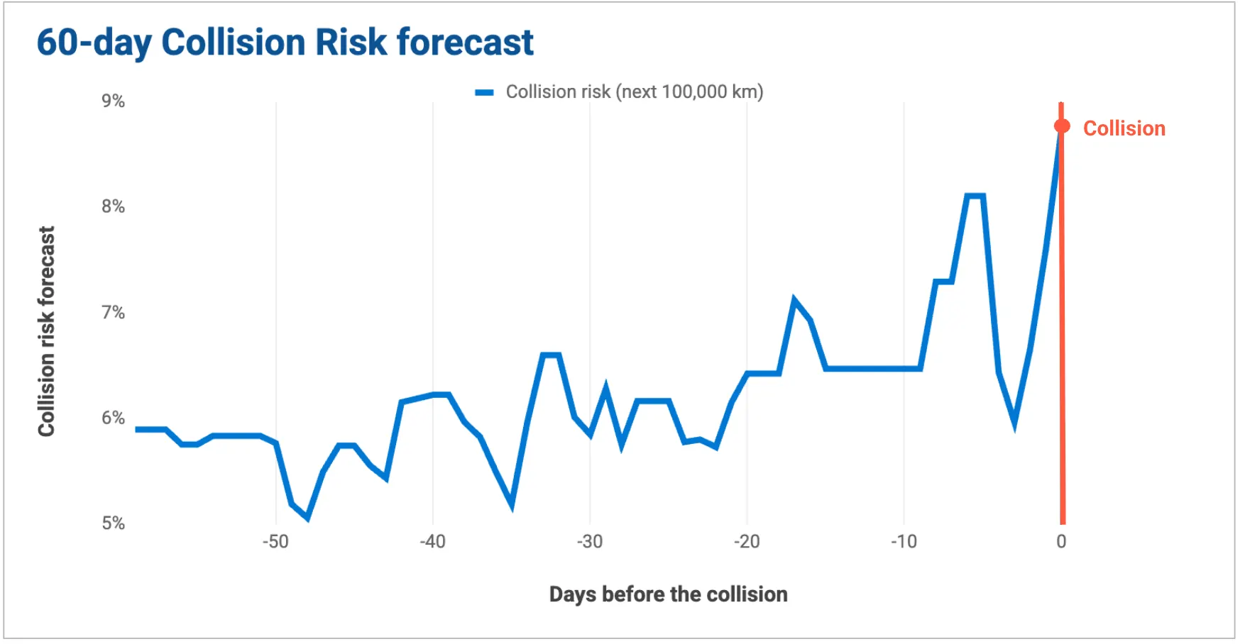
Can you spot the signals of danger?
If you were the fleet manager, when would you start coaching?
This story isn’t an isolated incident. From our observation, fleets with spotless safety scorecards still experienced excessive collisions. Your scorecard isn’t lying to you, but it’s not always the best tool for the job. Traditional behavioral scorecards act like a rearview mirror, calculating aggregate math on what already happened. Geotab’s predictive model looks through the windshield, forecasting who is statistically more likely to crash next.
Let’s unpack the 4 warning signals that bypassed the scorecard and how a collision risk model could have changed the ending to this story.
The 4 missed collision signals
Signal 1: The trend that only an outcome-trained model can capture (weeks before the accident)
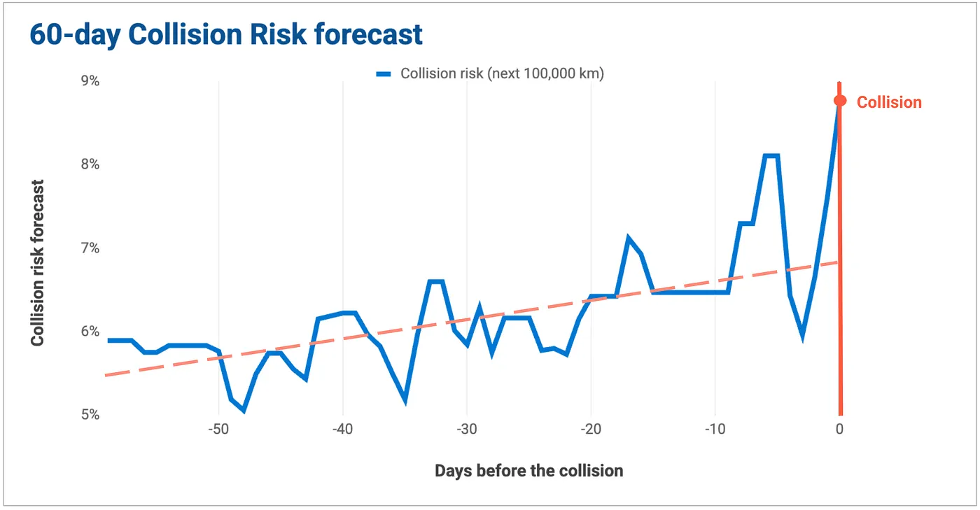
The first warning sign didn’t look like an emergency. As you can see in the 60-day forecast chart, it was a slow, volatile, upward crawl. On a traditional scorecard, this driver remained in the green.
The Collision Risk model is engineered to capture the trend and reflect precise risk level due to these reasons:
1. Continuous Lower Thresholds vs. The “Cliff Effect”
Scorecards generally evaluate high-threshold exceptions — like a harsh braking event of 0.5g (intense enough to spill your morning coffee). This creates a “cliff effect”: If a driver accumulates a high frequency of near-threshold events, like consistently hitting 0.45g, they don’t trigger the scorecard rules.
Geotab’s model tracks the lower-threshold data beneath the surface. It knows that a heavy cluster of “almost-accidents” could be the mathematical fingerprint of a systemic habit — like chronic tailgating or phone distraction. It catches the behavior before it can graduate into a real collision.
2. Outcome-Trained Standardization vs. Manual Guesswork
Scorecards require fleet managers to guess what safety thresholds look like, requiring you to arbitrarily decide if an event is dangerous enough to warrant a custom rule (e.g. “Is 0.45g bad enough or does it have to be 0.6g?”). That guesswork gets harder when your fleet mixes vehicle types: what’s risky for a heavy-duty truck is not the same as for a compact delivery van.
The model skips the guessing game, removes this cognitive burden with mathematical standardization in two distinct ways:
- A Unified, Bounded Scale ([0, 1]): Instead of raw event counts that can balloon into the thousands with no upper bound, the model outputs a “likeliness to crash” forecast between 0 (0%) and 1(100%).
- Built-in vehicle context: The model automatically adjusts for vehicle size and type. A harsh braking event from a large commercial truck is a very different event than the same reading in a passenger car.
Both are possible because the model was back-trained on actual collision data across 1.98 million vehicles and establishes the analytical relationship between behaviour and predictive collision risk. In a nutshell, it can identify which patterns are statistically meaningful from real outcomes.
3. Explainable metrics vs. empty points
And even if your scorecard goes from 80 to 90, what does that actually mean? What does that make you? How much safer are you?
The card can’t always answer that. A model forecast instead, changing from 6% to 9% means exactly 50% riskier.
What could have been done differently:
Instead of waiting for an end-of-month report, the manager sees a clear, volatile driving pattern with multiple small spikes and gradually upward trend, and decides to keep the driver’s performance under closer review.
Signal 2: The sudden spike (9–6 days before the collision)
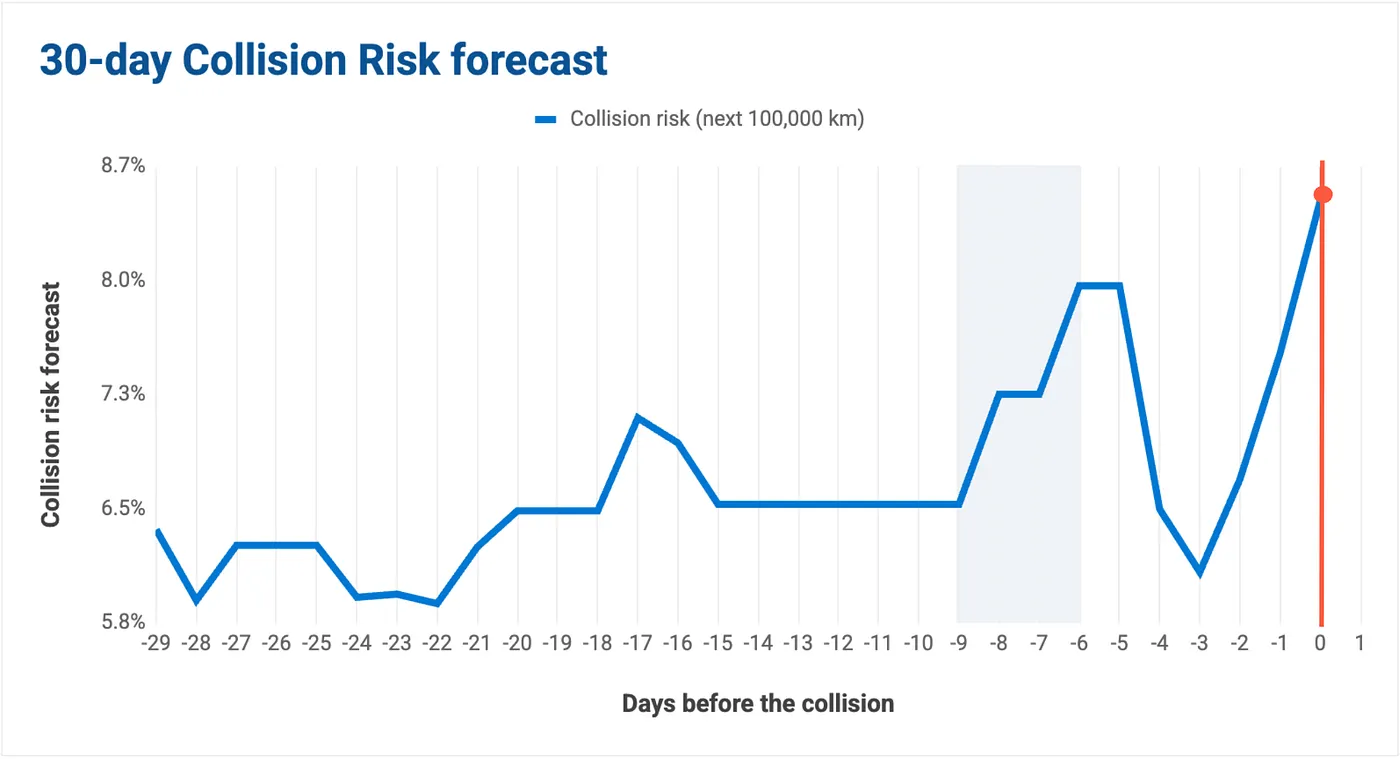
Nine days before the crash, the driver’s risk forecast jumped sharply off the baseline. It was the first unambiguous alarm. It went unheard.
This reveals the two core differences in how these tools are built.
1. Daily Real-Time vs. The Monthly Cadence
Scorecards are usually built for a monthly report. The Collision Risk model runs daily, meaning it’s able to capture the more granular day-to-day changes better.
2. Time-based vs Distance-based
Time-based math can mask true risk profiles: The dangerous behavior like the 3-day spikes gets diluted by the three quiet weeks if the driver has been on a vacation and the vehicle has been inactive, leaving the driver looking low-risk on paper. The Collision Risk model fixes this by evaluating a rolling window of the last 500km of actual driving. By measuring distance instead of calendar days, it ensures that drivers without enough data — or those returning from a long break — are represented accurately.
What could have been done differently:
This is the first critical window for intervention. Geotab’s platform surfaces drivers with elevated risk and the manager could choose to pick up the phone for a soft check-in: “Hey, you drove a little off-kilter today, just checking in to see what’s going on.” That one call could have broken the cycle entirely.
Signal 3: The false sense of security (5–3 days before the collision)
After the spike, the risk score fell back.
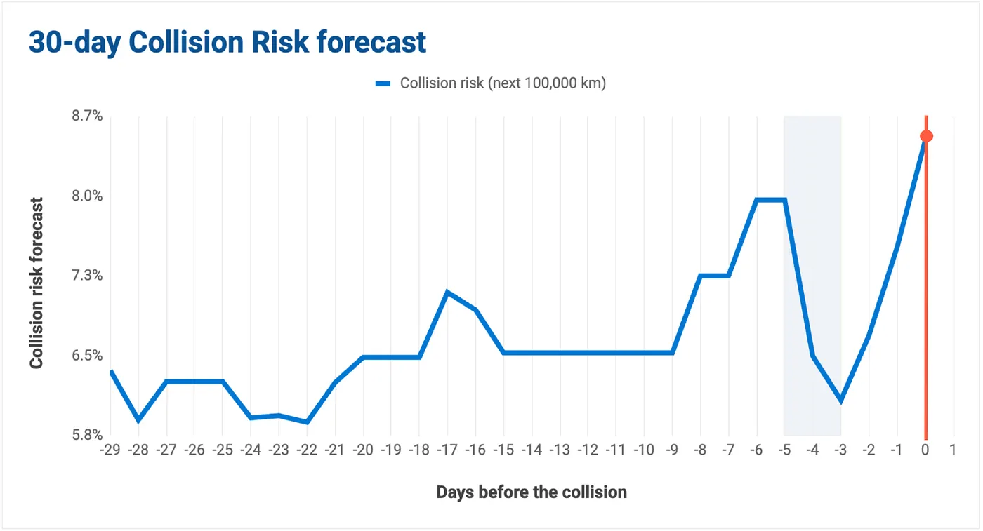
To a traditional scorecard, this looks like a success story: The driver corrected the course, the points looked better.
But in reality, it can provide a false sense of security. Meanwhile if a fleet manager looks at our collision risk dashboard, they see a continuous time-series graph that forces daily volatility to remain visible.
And the algorithm understands that a temporary three-day dip in isolated events does not statistically erase the underlying, systemic crash risk that was building over the previous 60 days.
What could have been done differently:
A manager watching the continuous model likely would not have interpreted the drop as resolution. With 60 days of context visible, the prior coaching session still open, the driver stays on the list.
Signal 4: The 3-day rise (the missed final call)
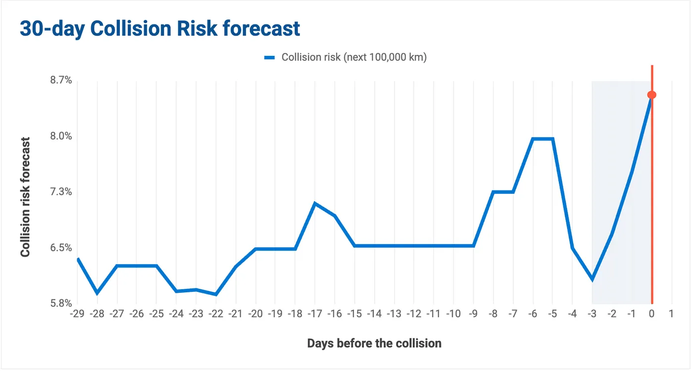
Just three days before the crash, the driver’s risk skyrockets one last time. This is the critical last call for intervention, any coaching that happened on any of the 3 days could have changed the story.
The Collision Risk model understands that a sudden escalation following a two-month behavioral deterioration is likely a statistical precursor to a collision. It leverages the distance-based context of 500Km of driving behavior.
What could have been done differently:
Because the manager was already tracking this pattern across all three prior signals, this spike would not have been dismissed as “just a bad day”. An urgent coaching conversation, earlier, sustained intervention could have given a fleet its best chance to change a driver’s trajectory.
What the scorecard said
We looked at the exceptions triggered 19 days before the accident, and saw only one type of collision-related exception: 10 speeding events.
On paper, this driver would have looked almost perfect since they have recorded 0 harsh event.
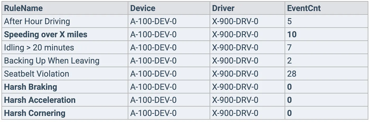
Here is why: fleet managers often set high event thresholds for their scorecards, as they are typically interested in extreme events. Extreme events seem the most “coachable,” but they don’t happen very often. Thus, a lot of smaller-magnitude events get missed.
In reality, smaller-magnitude events are equally alarming, yet they are not typically monitored by fleet managers. This driver is the perfect example of that. They did not record any extreme events in the picture above (such as harsh acceleration, harsh braking or harsh cornering), but they did incur more lower-magnitude events captured by the Collision Risk model, which was an indicator that their driving behavior was worsening.
Don’t use a screwdriver to hammer a nail
As our product manager put it: the right tool matters. The mechanics behind this story point to something bigger than the 4 signals.
Benchmark with your ‘digital twin’, not just yourself
Most fleets measure progress against their own history. The Collision Risk model benchmarks your drivers against similar fleets operating in comparable conditions, across 6 million connected vehicles. You get a more honest picture of where you stand in the industry, not just against last quarter.
The model accounts for the context your scorecard misses
A harsh braking event on a highway at 2am is not the same risk as one in a school zone at 8am. Scorecards treat them the same. The Collision Risk model adjusts for road type, weather, time of day, and area-based risk — and it correlates these factors against verified collision outcomes.
This is also a CFO conversation, not just a safety one
If all you have is a scorecard, you can show scores improved. That’s hard to put a dollar value on. If your collision risk score decreases by 10%, you can translate that into a projected reduction in collision cost — before a crash happens to prove it. That’s the difference between a safety report and a business case.
Keep your scorecard for operations if you need to. But if your true goal is to stop crashes before they happen, it’s time to move to Geotab Collision Risk.
Subscribe to get industry tips and insights
Frequently Asked Questions
The Geotab Data & Analytics Team write about news related to data.
Table of Contents
Subscribe to get industry tips and insights
Related posts


Fleet accident management: How to improve safety and reduce costs
September 4, 2026
5 minute read

Driver risk management: How public fleet managers save time with smarter video tools
September 2, 2026
3 minute read

How video telematics helps drivers trust the safety program
August 27, 2026
4 minute read

Lone worker safety for utility fleets: A checklist for the sites beyond cellular reach
August 24, 2026
3 minute read